
Saturday, 3 December 2016
Changes made to promotional poster
The purpose of a promotional poster is to promote the artist. Once we had finished what we thought was our final edit for our promotional poster we decided to show our teacher for feedback. Altogether we realised aspects of what we had created on Photoshop didn't match up to the standards of a promotional poster promoting the genre indie pop, so we decided to redo it.
As we were stuck on ideas we decided to look back at our RMA research.

As we were stuck on ideas we decided to look back at our RMA research.

Lana Del Rey's promotional poster really stood out to us as it is simple and straight to the point. We relaised that the most important part of the poster should be the artist's name followed by a clear photo of them. We originally used a different photo to the digipak. Making this descion was a mistake as the photo didn't link to the album. In fact it didn't even show the artists face. Another thing which needed changing was the layout of the poster. As the photo we used was a screenshot the imageon Photoshop was atomically set to landscape instead of portrait.
Changes made
- Photo
- Tittle size and colour
- Layout
- no 'out now'
- no social media links
- release date added
 |
| First edit |
 |
| Final edit |
Promotional poster
My partner Imogen and I began editing our promotional poster after we finished our digipak. We decided that we wanted to keep it simple and straight the point as the purpose of a promotional poster is to promote the release of an album.
The first thing we did was upload the image onto Photoshop CS6 which was a screenshot taken at 01:27 of the music video my partner and I had made to the song 'Set Sail'. I decided to pick it as the final image for the promotional poster as it shows narrative and performance. As there is no star image within the photo, we decided to add another photo of the artist/actress to enforce artist recognition within the target audience. However, as we didn't want the photo to be too distracting we changed the opacity of the image to 80%.
Between us, we decided that the most important feature of the poster should be the artists name/logo therefore we decided to locate it centre image. To try make the logo even more eye catching we changed the colour of it to black by using the paint bucket tool. We were originally planning on using the same font we had used for the album name. However, once pasted onto the poster it looked out of place with the arrangement.
We found the out now writing from Google images. To attract the audiences attention I wanted the writing to be big and bold. At first I was planning on using a font from PowerPoint. However, none of them fitted theme of the promotional poster. As the photo was taken from google images it had a white background. To erase it, we simply dragged the Magic wand tool from the panel on the left and clicked on what we wanted to erase. To make the writing stand out even more I changed the colour of it to a brighter red.
We thought it was important to use social media logos on the promotional poster to make it clear to the audience on where you can find and listen to the album. We decided on choosing iTunes, YouTube, Spotify, Facebook and Twitter.
For the finishing touches of the poster we added a decorative box and additional lines to continue the theme of the digipak.

Friday, 2 December 2016


Changes made to digipak
Once we had finished the final edit for our digipak we realised something wasn't quite right. Instead of squaring the image of the front cover to fit the digipak template we stretched the image which made the face look distorted. However, fixing this problem was easy! as we saved the document as a Photoshop file instead of a jpeg it allowed us to make any changes we wanted to the document. We fixed the problem by stretching the image to it's original size which we then squared to fit the template using the crop tool. Another small change we made to our final edit was the layout of the artists name. To make the writing look bolder we added a white background which we then changed the opacity to match the album name.
 |
| First edit |
 |
| Final edit |

Digipak - back panel
This was my first edit of my back panel. As you can see the image is very similar to the finalised idea I had for my digipak. Overall I really liked this edit as I thought It showed narrative. However, when I showed my teacher Miss Dobbs she said the image wasn't my own therefore I couldn't use it as it would be classed as plagiarism.
Deconstruction:
To start with, the first thing I did was upload an image of the sea onto Photoshop. I decided to choose a picture I had taken at Bournemouth beach a few years ago, as I thought it reflected the song which my partner and I had chosen to make a music video to 'Set Sail'. I changed the photo into black and white to continue the theme of the digipak and then adjusted the curves to make the darker sections of the image even darker.
As I wanted the target audiences full focus to be on the sea I decided to crop the image down using the crop tool from the left hand panel.
I used the same vignette filter from the first edit of the front panel. I did this to create a retro filter which'll make the the audience refer back to our artists genre, indie pop. The key to using this filter is that it will draw the viewers attention towards the song titles.
As my partner and I had done previous research on our artists record company, Communion. We decided to incorporate it into our back panel instead of making a new one. When making an album it is vital to include the names of all the producers/ record companies who have helped produce the album, this is because they own the legal rights to part of the music.
I found the newest logo of communion records on google images. I placed it to the right of the barcode as I didn't want it to stand out too much. Yet again to continue the theme of the digipak I changed the opacity to 78%.
Deciding the names of the individual songs for the album took quite a while as I wanted them to fit with the artists genre. In the end I decided to choose stereotypical love song names:
 |
| Draft |
Deconstruction:
To start with, the first thing I did was upload an image of the sea onto Photoshop. I decided to choose a picture I had taken at Bournemouth beach a few years ago, as I thought it reflected the song which my partner and I had chosen to make a music video to 'Set Sail'. I changed the photo into black and white to continue the theme of the digipak and then adjusted the curves to make the darker sections of the image even darker.
As I wanted the target audiences full focus to be on the sea I decided to crop the image down using the crop tool from the left hand panel.
I used the same vignette filter from the first edit of the front panel. I did this to create a retro filter which'll make the the audience refer back to our artists genre, indie pop. The key to using this filter is that it will draw the viewers attention towards the song titles.
As my partner and I had done previous research on our artists record company, Communion. We decided to incorporate it into our back panel instead of making a new one. When making an album it is vital to include the names of all the producers/ record companies who have helped produce the album, this is because they own the legal rights to part of the music.
I found the newest logo of communion records on google images. I placed it to the right of the barcode as I didn't want it to stand out too much. Yet again to continue the theme of the digipak I changed the opacity to 78%.
Deciding the names of the individual songs for the album took quite a while as I wanted them to fit with the artists genre. In the end I decided to choose stereotypical love song names:
- Breathe
- Set Sail
- Without You
- Last Goodbye
- Jump
- Pray
- Demons
To create the barrier around the text I simply changed the layout of PowerPoint to the centre. I then highlighted and pasted the text onto Photoshop. Once I had pasted onto Photoshop I stretched the writing to match the front panel.
For the finishing touches I added a second boarder and additional lines.
 |
| Final |
Digipak - inside panel/ further editing
As not much 'colour' editing went into making the inside panel I thought I'd do further editing on it by changing it into black and white to fit the theme of the other panels of the digipak. As you can see it's not as effective, as the images within it are harder to identify.
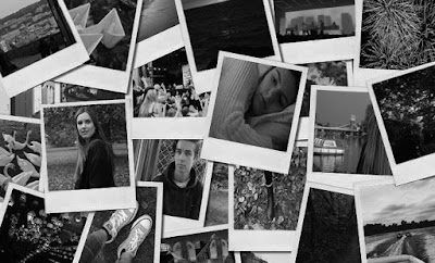

Digipak - Inside panel
I decided I wanted the inside panel to be an 'inside' to the singers life. I thought the perfect way of expressing this idea of mine would be from using a collage of polaroid films bundled together.
As I wanted it to look as realistic as possible I decided to pick a template from google Images.
 To cut the example photos out of the original image I used the Polygonal lasso tool on PhotoShop. The reason why I decided to use the Polygonal lasso tool instead of the popular Lasso tool was so I could get a neat cut on the image. I then deleted the existing image and placed the new image as a layer to fill the gap in. The process of doing this was very time consuming as each image had to be individual cut and placed as a new layer.
This was my first draft for the inside panel. As you can see, I wanted to go for an autumnal/relationship theme to match the music video my partner and I had made. However, as some of the images weren't my own I couldn't this as my final as it would be plagiarism.
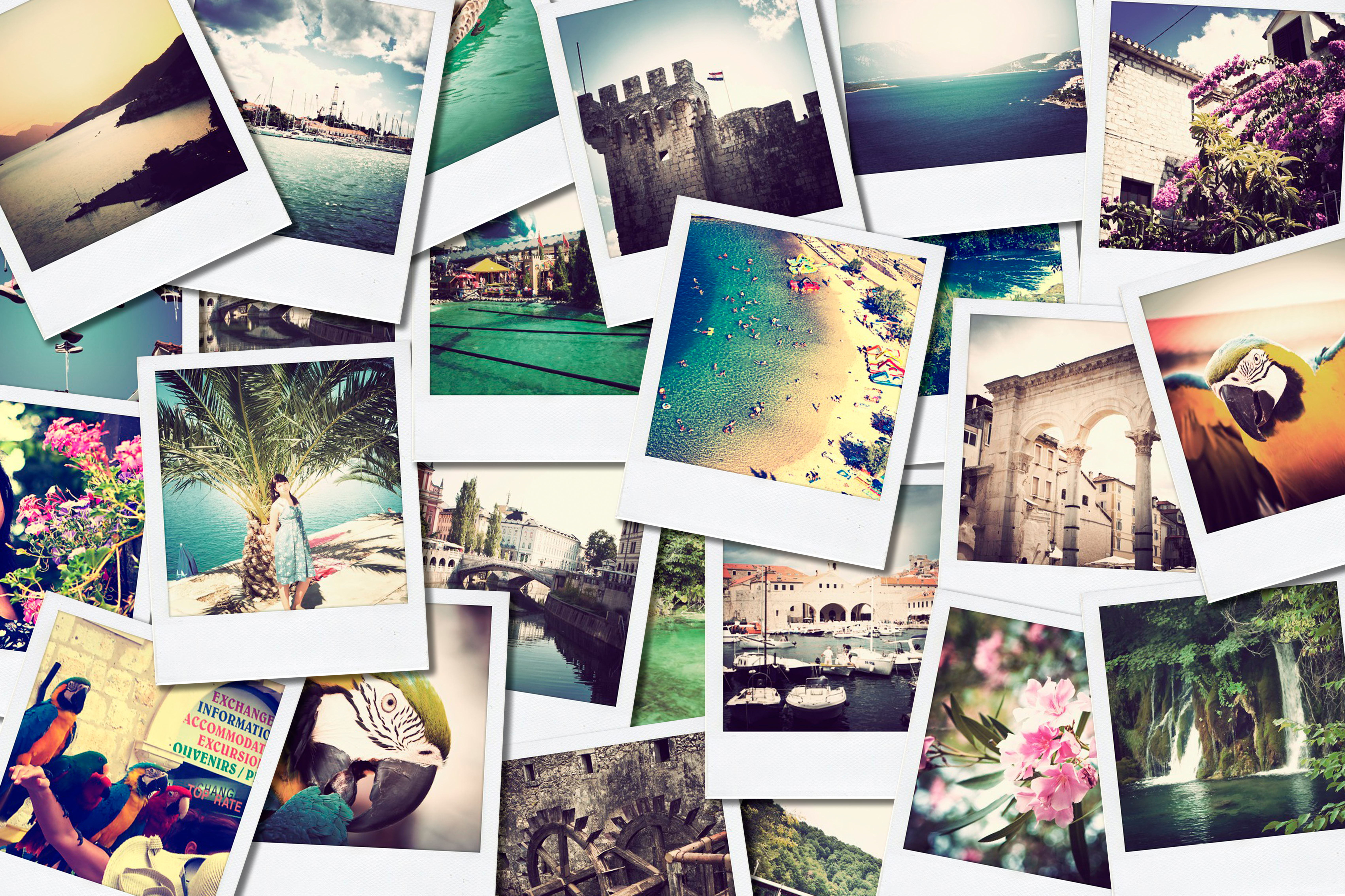
In the end I decided to redo the inside panel using the photos from my camera roll which I had taken.
As I wanted it to look as realistic as possible I decided to pick a template from google Images.
 |
| Template |
 To cut the example photos out of the original image I used the Polygonal lasso tool on PhotoShop. The reason why I decided to use the Polygonal lasso tool instead of the popular Lasso tool was so I could get a neat cut on the image. I then deleted the existing image and placed the new image as a layer to fill the gap in. The process of doing this was very time consuming as each image had to be individual cut and placed as a new layer.
This was my first draft for the inside panel. As you can see, I wanted to go for an autumnal/relationship theme to match the music video my partner and I had made. However, as some of the images weren't my own I couldn't this as my final as it would be plagiarism.
In the end I decided to redo the inside panel using the photos from my camera roll which I had taken.
 |
| Draft |
 |
| Final |
Thursday, 1 December 2016
Digipak - Front panel
Deconstruction:
For the front cover I originally wanted to take head shots of our actress Summer on a different day to shooting so that the album promotes all of the artists work. However, the photos I took which are shown on the blog 'potential photos for digipak and promotional poster' didn't show any form of star image which was important for my partner and I as we wanted the target audience to relate to her work as much as possible. As I didn't take many successful portraiture photos I decided rewatch all the videos and take a screenshot of when direct eye contact between Summer and the camera was made.
The first thing I did was upload the screenshot to Photoshop CS6. I decided to change the photo into black and white so it would enable me to change the settings drastically without the original image looking too pixelated. As the black and white image was looking soft and unedited I sharpened the image with the gradient tool on the right panel so that the dark colours would appear even darker.
From research on RMA's artists such as Birdy tend to use a vintage theme to their work to illustrate their chosen genre i.e. indie pop. As I have picked an artist from the same genre I thought I would take inspiration from other RMA's into my front panel. In the end I decided to choose a vignette filter from Google images. The vignette filter is a retro filter which naturally brings your eyes to centre image, which in this case will be the girl.
As I placed the image onto Photoshop the opaque filter completely covered the first layer. To stop this from happening I changed the opacity to 11% . The reason I decided on having such a low percentage was to stop it from being such a distraction to the original image.
I had previously created the artist logo from a font website online (1001 Free Fonts: Download 32973 Fonts). I wanted the font to look handwritten to make the album look personal to the artist. Like the filter I also decided to change the opacity of the logo to 69% to match the theme of the artwork. As you can see I placed the logo top left of the panel, I did this because I wanted to make the album name centre. I decided on the colour of the text by using the Eyedropper tool to selected the lightest colour of the image which I then filled in using the Paint bucket tool.
Choosing the name of the album was quite challenging As it needed to suit all the songs. In the end my partner and I decided on the name Breathe which will also be a name of a song from the album. The reason we decided on the name breathe is because the album is about taking a breather and moving on from a unstable relationship.
I didn't think it was was right to repeat the font which I used for logo for the album name, the reason is because I thought the artist will be able to contentiously use the logo for future releases without it looking too overused. To create the album name I wrote the text onto PowerPoint which I then copied and pasted onto Photoshop. The chosen font I used was called Nueva Std. The boarder around the text was unintentional however I found it quite interesting and intriguing on the eye as its different. As you can see the opacity has been changed to 26%.
After all the informative information was added to the front panel it still looked rather bare so I decided to add in straight lines using the Line tool. After adding the lines in, it really brought the artwork of the album together.
Finally to complete to front panel I darkened the image even more using the Curves tool on the right hand panel.
 |
| Final |
Wednesday, 30 November 2016
comparing to RMA's
After we had finished editing our music video my partner Imogen noticed that some of the shots we had used were very similar to Birdys music video, Shelter.


Bloopers
I decided to create a bloopers video to show all the funny moments and issues we had when filming. Unfortunately as I didn't have the premium software to Wondershare Filmora I couldn't download the edit so I decided to upload a recorded version onto YouTube.

Colour grading

Once Imogen and I were happy with the order of the shots we decided to edit the colour, lighting and contrast of each shot by using the colour grading tool in premiere pro. Using the colour grading tool was quick and simple. However, as we edited nearly every shot the process started to become very tedious but the overall outcome was worth it as the shots looked more professional.
Tools used in premier pro
Here are a few of the tools we used when editing in Premier Pro
- We constantly used the selection tool to click and drag a clip anywhere we wanted to
- The ripple edit tool was used to merge clips together. We tended to use this tool when we didn't know what the put in the blanks of our music video
- We used the rate stretch tool to stretch any clip we had made too short
- The razor tool was our other most used tool as it allowed us to cut and split any footage
- We normally used the zoom tool just before we cut the footage using the razor tool as we could be more precise to the second

Chronological order
As we began editing or music video we started to relaise something wasn't right, we had put the music video in chronological order. Chronological order can look effective for some music videos however it didn't fit the theme of ours. As we didn't know how to change it we decided to talk to our teacher Miss Dobbs. She suggested to repeat the same shots whenever the lyrics repeat, so as a three we broke the lyrics down of the song. Hopefully by doing this it will allow the music video to have more of a flow.
Overall there wasn't much repetition in the lyrics:
- Will you be that someone
Will you set sail
Will you set sail tonight
Till we see land
Never look back or behind
- I don't know if we'll get lost at sea
Or we'll end up where we're supposed to be
Are you brave enough to swim against the tide?
 |
| Class notes |
 |
| Class notes |
Class feedback
Once we had edited our first and second draft we
decided to show the class for feedback.
Improvements to be made:
- Include more head shots of the singer to show star image
- Improve on lip syncing timings
- Refilm boat scene without the girl
- Change colour of paper boats to match prop research
- Cut photograph scene out
- Cut clothes scene out
- Dog is not irrelevant to the storyline
- Too many shots of the boy
- Light exposure is too high in some shots
Thursday, 3 November 2016
Wednesday, 2 November 2016
Re-shoot / diary
We originally wanted the boat scene to be a series of consistent shots of our main character releasing the paper boats into the water. However, when looking at the shots we got from the day they didn't match our expectations as Summer was more of a distraction to the boats themselves, or the shots we took were out of focus. Another thing which needed to be changed was the boats themselves. Unfortunately before the day of shooting my partner Imogen didn't have any red paper to make the boats so we decided to change them to pink. Changing the paper to pink was a bad idea as it made the purpose behind the prop research irrelevant.

Day 5: Wednesday 16th November 2016
Imogen and I arrived at location number 4 at 12:25 am, lunchtime. We decided to buy red card from reprographics in school so Imogen could make all the paper boats in her free periods. As we wanted the main focus to be on the paper boats, we decided to cut the main character from the scene. We both didn't want to travel all the way to Marlow for a short reshoot so we chose to film at the pond in our school. Filming at school will allow us plenty of time to perfect the shots.
As we both knew exactly what we wanted to do we were done with filming after 15 minutes. Within the 15 minutes we filmed each boat being placed into the water and still shots. As weather conditions on the day of filming were very mild Imogen had to blow on to boats to move them across the pond. The camera was placed on a tripod at all times.

Tuesday, 1 November 2016
Filming Journal
Day 1: Saturday the 5th November 2016

 As our actress Summer started to loose concentration after the first hour of filming we decided to have a shot 15 minute break to regain our energy. During the 15 minute break Imogen and I stuck photographs onto the wall. I originally thought the photographs would be a clever connecting prop of the couple. However, once they were on the wall they looked out of place with the mise-en-scene.
Day 2: Sunday 6th November 2016

 As filming was rescheduled last minute I was unable to turn up due to my contracted work hours. However, my partner Imogen was more than happy to film on her own as she knew exactly what to do from looking at the filming schedule I had previously made.
Today we filmed the first part part of our music video at location 1 (Summers bedroom). Unfortunately the weather was not on our side as the sky was grey and dull with weather reports informing us that there would be a continuous downpour of rain throughout the day.
Imogen and I arrived at Summers house at 08:05 am. However, our actress Summer was not ready so we decided to make the most of our time by setting up the filming equipment.
Once Summer was ready we went through the lyrics of our chosen song 'Set Sail' to make sure she was confident with her lip syncing skills. Even though Summer knew all the words to the song we thought it would be a good idea to hold the lyrics up against the camera in case she forgets them. The trick to getting lip syncing on time is to sing out loud. Summer was a bit nervous with the idea of her singing alone so my partner and I decided to sing along with her as we are planning on editing out all the audio during post production.
We tried sticking to our shot list as much as possible however once we started filming we realised there wouldn't be enough footage to put into our music so we filmed extra head shots of Summer looking directly at the camera for potential fillers in our music video.

Day 2: Sunday 6th November 2016
My partner Imogen, actor Fraser and I arrived at
Marlow train station half an hour before the train approaches the station to
allow us time to get organised with setting up the filming equipment.
Everything was going to plan until we spotted a woman who had previously
collapsed on the platform with a paramedic. Out of courtesy we decided plan a different day to
film Fraser boarding the train.
As we were unable to film on the train station platform we thought we'd make the most of our time with our actor, so we decided to film Fraser walking towards the train station.
As we were unable to film on the train station platform we thought we'd make the most of our time with our actor, so we decided to film Fraser walking towards the train station.
Day 3: Tuesday 8th November 2016
 As filming was rescheduled last minute I was unable to turn up due to my contracted work hours. However, my partner Imogen was more than happy to film on her own as she knew exactly what to do from looking at the filming schedule I had previously made.
As the terms and conditions set by GWR were to avoid filming during peak time my partner Imogen decided to pick the 4:30 pm train. The only problem Imogen faced when filming at this time was that the lighting had changed drastically from the previous filming date. Unfortunately, as
Imogen arrived at the train station the train was already at the platform. Which
meant she couldn't film the train arriving.
Imogen and Fraser managed to get a carriage with six available seats so they had plenty of space to set up the filming equipment. Whilst Imogen was doing test shots of Fraser looking out the train window, Imogen said the ticket man asked if they had a licence to film. In response to the question Imogen showed our schools public liability insurance and permission to film email from James.
When filming Fraser Imogen had to be super quick and prepared as they were getting off at the next station, Bourne End. As there is a change over at Bourne End it allowed her extra time in filming him getting on and off the train.
Day 4: Saturday 12th November 2016
Filming our actress Summer was very challenging and time consuming as we faced many interference's such as change of weather, lighting and the public. As we were outside Summer wasn't confident with lip syncing so we decided to find an empty area of the park to film her. However, the majority of the shots we captured, Summer was either out of sync or wasn't looking directly at the camera. In the end we decided to focus on getting the establishing shots and Fraser's part done for the day, so we could then film Summer on another day at a location she feels more comfortable at.
Day 4: Saturday 12th November 2016
Imogen drove Summer and I to our final location, Higginson park. Due to traffic we arrived half an hour later than we had originally planned for so we texted our actor Fraser to let him know that we're behind schedule.
Saturday, 29 October 2016
Lip syncing
Lip sync (short for lip synchronization) is a technical term for matching a speaking or singing person's lip movements with prerecorded sung or spoken vocals that listeners hear, either through the sound reinforcement system in a live performance or via television, computer or cinema speakers in other cases. The term can refer to any of a number of different techniques and processes, in the context of live performances and audiovisual recordings.

Friday, 28 October 2016
Filming plan
My partner and I decided to make a shooting schedule for each day of production. By doing this it enabled us to plan our time efficiently and kept us organised.
Day 1: Saturday 5th November 2016
Location 1 - Girls bedroom
Time
|
|
08:00 am
|
Arrive at location
|
08:15 am
|
Set up filming equipment
|
08:25 am
|
|
08:30 am
|
Lyric rehearsal
|
09:00 am
| Overview of potential hazards |
09:05 am
|
|
10:30 am
|
Short break
|
10:45 am
|
Begin filming
|
12:00 am
|
End of filming at location one
|
12:05 am
|
Pack up filming equipment
|
Day 2: Sunday 6th November 2016
Location 2 - Marlow train station
Time
|
Description
|
1:00 pm
|
Arrive at location
|
1:05 pm
|
Set up filming equipment
|
1:15pm
|
Overview of potential hazards
|
1:20 pm
|
Film the train station platform
|
1:30 pm
|
Film the train approaching the platform
|
1:33 pm
|
Move filming equipment
|
1:35 pm
|
Begin filming boy walking onto the train
|
1:40 pm
|
Move filming equipment onto the train
|
1:45 pm
|
Film boy on the train
|
1:55 pm
|
Move filming equipment
|
1:57 pm
|
Film boy stepping off the train
|
2:00 pm
|
Move filming equipment onto the platform
|
2:05 pm
|
Film the platform
|
2:10 pm
|
Pack up filming equipment
|
Day 3: Saturday 12th November 2016
Location - Marlow park/ river
Time
| |
11:00 am
|
Arrive at location
|
11:15 am
|
Set up filming equipment
|
11:25 am
| |
11:30 am
|
Lyric rehearsal
|
12:00 am
| Overview of potential hazards |
12:05 am
| |
01:30 pm
|
Short break
|
02:00 pm
|
Begin filming
|
03:00 pm
|
End of filming at location one
|
03:05 pm
|
Pack up filming equipment
|
Subscribe to:
Posts (Atom)