Saturday, 3 December 2016

Promotional poster

My partner Imogen and I began editing our promotional poster after we finished our digipak. We decided that we wanted to keep it simple and straight the point as the purpose of a promotional poster is to promote the release of an album.

The first thing we did was upload the image onto Photoshop CS6 which was a screenshot taken at 01:27 of the music video my partner and I had made to the song 'Set Sail'. I decided to pick it as the final image for the promotional poster as it shows narrative and performance. As there is no star image within the photo, we decided to add another photo of the artist/actress to enforce artist recognition within the target audience. However, as we didn't want the photo to be too distracting we changed the opacity of the image to 80%.

Between us, we decided that the most important feature of the poster should be the artists name/logo therefore we decided to locate it centre image. To try make the logo even more eye catching we changed the colour of it to black by using the paint bucket tool. We were originally planning on using the same font we had used for the album name. However, once pasted onto the poster it looked out of place with the arrangement.

We found the out now writing from Google images. To attract the audiences attention I wanted the writing to be big and bold. At first I was planning on using a font from PowerPoint. However, none of them fitted theme of the promotional poster. As the photo was taken from google images it had a white background. To erase it, we simply dragged the Magic wand tool from the panel on the left and clicked on what we wanted to erase. To make the writing stand out even more I changed the colour of it to a brighter red.

We thought it was important to use social media logos on the promotional poster to make it clear to the audience on where you can find and listen to the album. We decided on choosing iTunes, YouTube, Spotify, Facebook and Twitter.

For the finishing touches of the poster we added a decorative box and additional lines to continue the theme of the digipak.


Friday, 2 December 2016

Final edit - digipak

Front panel


Inside panels


Back Panel

Final edit

Changes made to digipak

Once we had finished the final edit for our digipak we realised something wasn't quite right. Instead of squaring the image of the front cover to fit the digipak template we stretched the image which made the face look distorted. However, fixing this problem was easy! as we saved the document as a Photoshop file instead of a jpeg it allowed us to make any changes we wanted to the document. We fixed the problem by stretching the image to it's original size which we then squared to fit the template using the crop tool. Another small change we made to our final edit was the layout of the artists name. To make the writing look bolder we added a white background which we then changed the opacity to match the album name.

First edit

Final edit


Finalised digipak


Digipak - back panel

This was my first edit of my back panel. As you can see the image is very similar to the finalised idea I had for my digipak. Overall I really liked this edit as I thought It showed narrative. However, when I showed my teacher Miss Dobbs she said the image wasn't my own therefore I couldn't use it as it would be classed as plagiarism.

Draft

Deconstruction:


To start with, the first thing I did was upload an image of the sea onto Photoshop. I decided to choose a picture I had taken at Bournemouth beach a few years ago, as I thought it reflected the song which my partner and I had chosen to make a music video to  'Set Sail'. I changed the photo into black and white to continue the theme of the digipak and then adjusted the curves to make the darker sections of the image even darker.

As I wanted the target audiences full focus to be on the sea I decided to crop the image down using the crop tool from the left hand panel.

I used the same vignette filter from the first edit of the front panel. I did this to create a retro filter which'll make the the audience refer back to our artists genre, indie pop. The key to using this filter is that it will draw the viewers attention towards the song titles.

As my partner and I had done previous research on our artists record company, Communion. We decided to incorporate it into our back panel instead of making a new one. When making an album it is vital to include the names of all the producers/ record companies who have helped produce the album, this is because they own the legal rights to part of the music.

I found the newest logo of communion records on google images. I placed it to the right of the barcode as I didn't want it to stand out too much. Yet again to continue the theme of the digipak I changed the opacity to 78%.

Deciding the names of the individual songs for the album took quite a while as I wanted them to fit with the artists genre. In the end I decided to choose stereotypical love song names:

  • Breathe
  • Set Sail
  • Without You 
  • Last Goodbye
  • Jump
  • Pray
  • Demons
To create the barrier around the text I simply changed the layout of PowerPoint to the centre. I then highlighted and pasted the text onto Photoshop. Once I had pasted onto Photoshop I stretched the writing to match the front panel.

For the finishing touches I added a second boarder and additional lines.

Final

Digipak - inside panel/ further editing

As not much 'colour' editing went into making the inside panel I thought I'd do further editing on it by changing it into black and white to fit the theme of the other panels of the digipak. As you can see it's not as effective, as the images within it are harder to identify.

Digipak - Inside panel

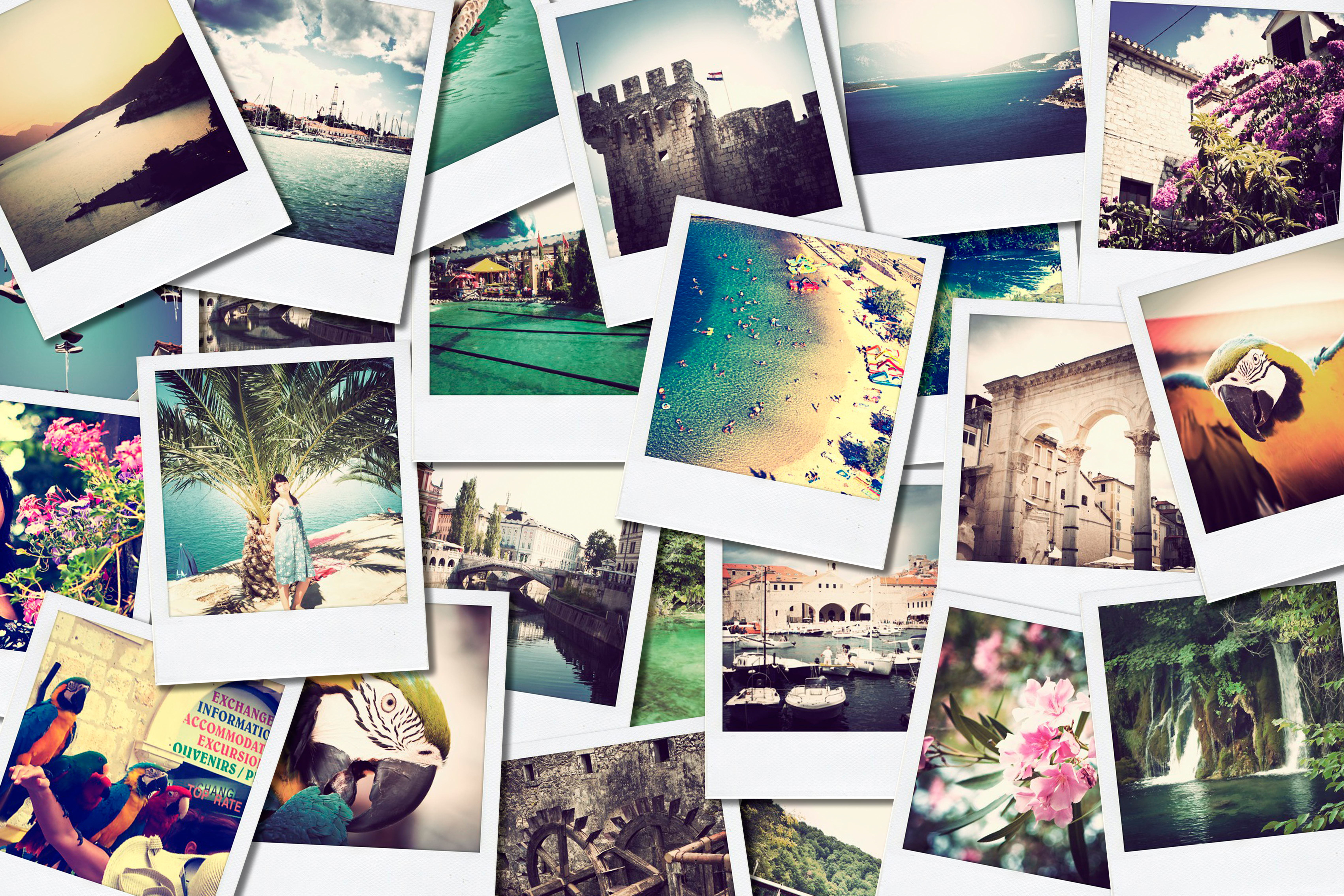
I decided I wanted the inside panel to be an 'inside' to the singers life. I thought the perfect way of expressing this idea of mine would be from using a collage of polaroid films bundled together.
As I wanted it to look as realistic as possible I decided to pick a template from google Images.

Template

Image result for polygonal lasso toolTo cut the example photos out of the original image I used the Polygonal lasso tool on PhotoShop. The reason why I decided to use the Polygonal lasso tool instead of the popular Lasso tool was so I could get a neat cut on the image. I then deleted the existing image and placed the new image as a layer to fill the gap in. The process of doing this was very time consuming as each image had to be individual cut and placed as a new layer.

This was my first draft for the inside panel. As you can see, I wanted to go for an autumnal/relationship theme to match the music video my partner and I had made. However, as some of the images weren't my own I couldn't this as my final as it would be plagiarism.
In the end I decided to redo the inside panel using the photos  from my camera roll which I had taken.


Draft


Final